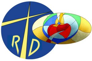
 Our logo consists in two intersected images.
The cross with the letters R D ( standing for Regnum Dei) has its origin in the speech that Paul VI addressed to the newly-born misssionary group in Rome in 1972 (see Our roots)
Here the Pope addressed to the young people ready to leave on a mission as “Heralds, messengers of the Great King”: such logo both expresses the universality of evangelization ( the whole globe), the means of evangelization (the cross), while the letters stand for the Kingdom of God. (Regnum Dei in Latin)
The oval windowpane in the chapel of the Community in Milano has been made by Patrizia Giannelli, following the directions of the members of the Community. It expresses the Marian charism, in strict connection with the message of Fatima : the commitment to evangelization and the announcement of the Kingdom of God find their fulfilment in the Marian consecration . The Hearts of Jesus and Mary are united in the common offer and in the Eucharistic sacrifice for the salvation of the world: they are hold in a blue chalice . From the heart of Jesus a stream of blood and water runs and it expands with no limits.
The whole image reminds us of our link to Mary : with her and in her we are linked to Jesus and to His mission. This mission is based on the offer of ourselves so that our life can be a stream of life for the “poor sinners”, as Virgin Mary said in Fatima.
The green that overlaps from the chalice symbolizes this new life that springs forth, while the white and the gold are symbols of purity and regality : they occupy the rest of the windowpane to show the expansion of the Kingdom of God in Christ


